Graphic Design and Merchandising
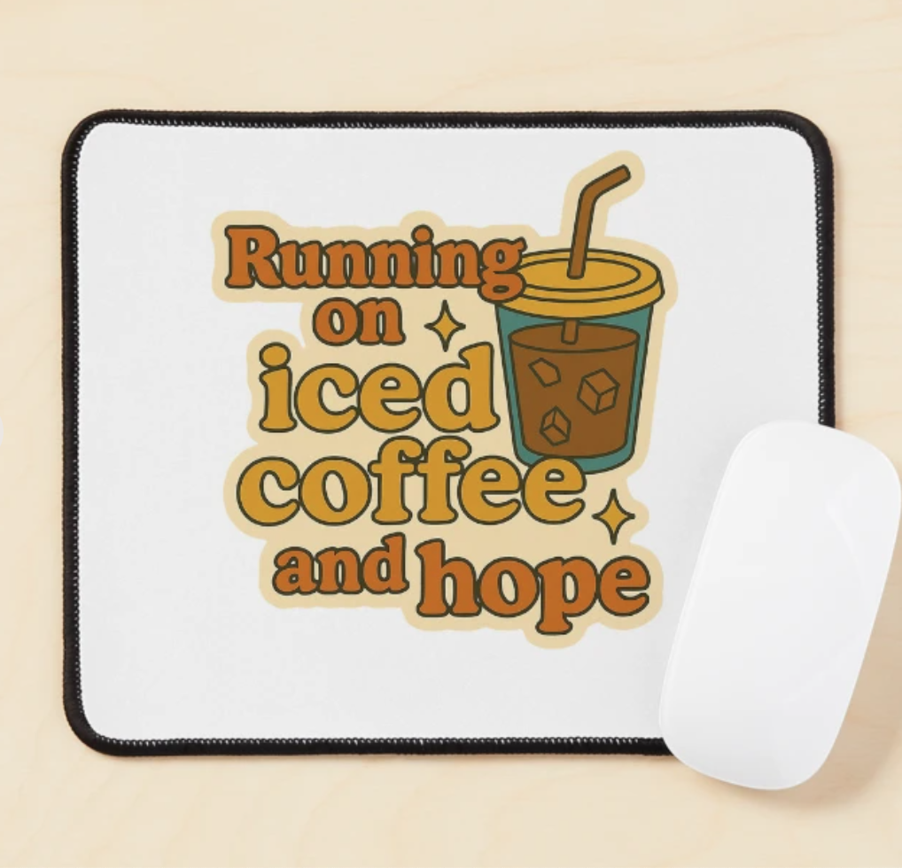
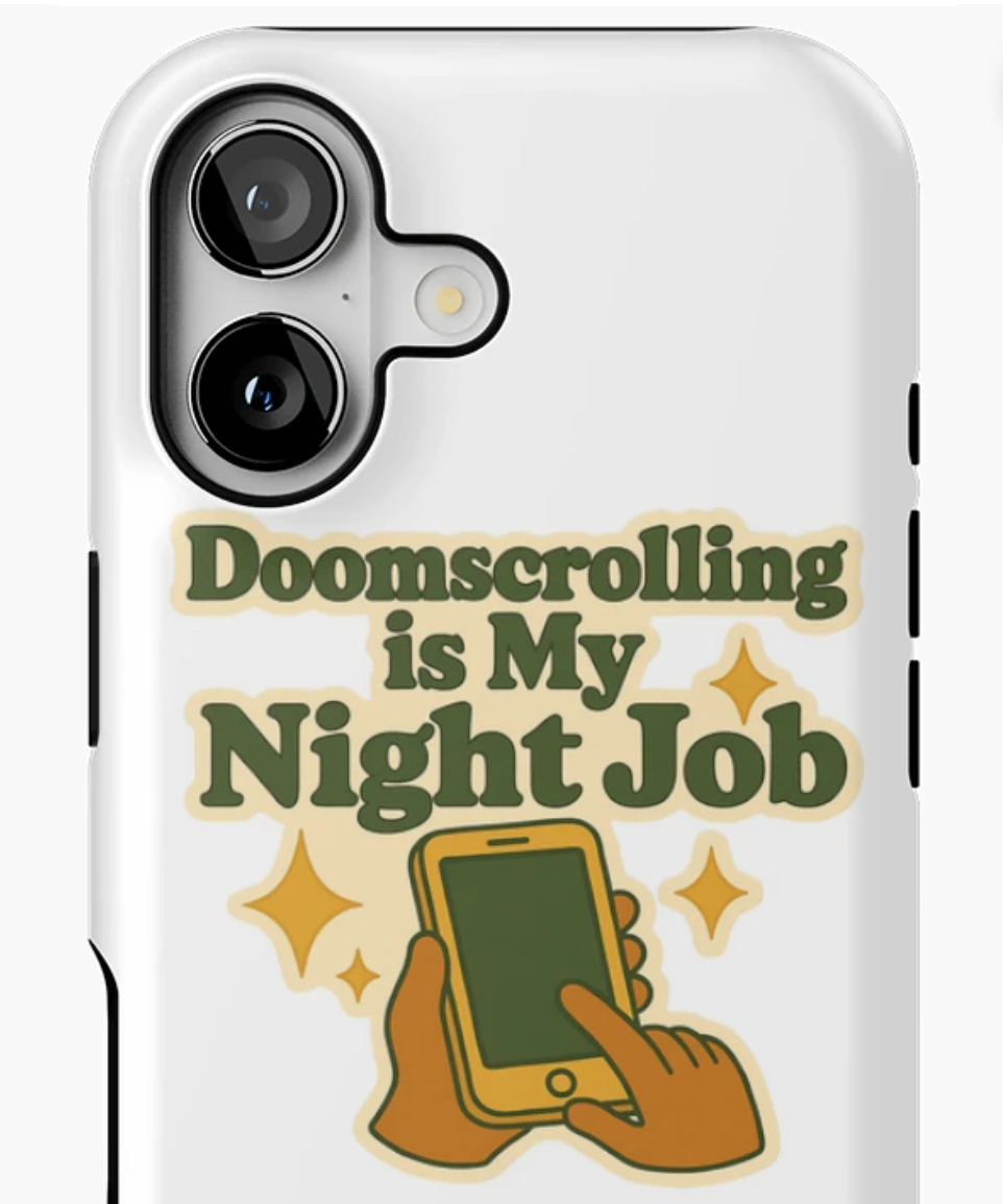
Self-Therapy is a merchandise project rooted in humor, sarcasm, and everyday emotional chaos. The brand uses playful, retro-inspired visuals and cheeky language to explore mental health, self-care, and the moments people usually cope with through humor.
The goal was to create designs that feel emotionally relatable, without being heavy or clinical. The work balances levity with sincerity, translating shared experiences like anxiety, burnout, and self-awareness into bold, wearable graphics that resonate with culturally plugged-in, wellness-oriented consumers. I led the creative direction from ideation through launch, building a scalable merchandise system designed for long-term growth across multiple product categories.

The goal was to build a visually distinctive wellness merchandise brand that felt honest, funny, and emotionally intelligent while remaining commercially viable in a crowded marketplace.
Key objectives included:
Translating abstract emotional experiences into approachable visual concepts
Creating a recognizable brand voice grounded in humor and self-awareness
Developing a cohesive visual system that could scale across products
Designing graphics optimized for print-on-demand production and discovery
The Goal
I led all creative, conceptual, and merchandising work for Self-Therapy.
My responsibilities included:
Concept development and creative direction for the brand
Design of original graphic concepts across apparel, stickers, accessories, and home goods
Creation of 25+ designs using vintage typography, saturated color palettes, and playful iconography
Development of a cohesive visual system adaptable across formats and sizes
Management of the product pipeline from ideation through launch
Optimization of designs for print-on-demand workflows and marketplace performance
Visual content strategy and curation to support discoverability and engagement
My Role
The Design Approach
The design approach centered on contrast: lighthearted visuals paired with emotionally honest language, retro typography, and bold colors.
I intentionally avoided clinical or instructional aesthetics. Instead, the visuals pull from vintage signage, playful iconography, and culturally familiar humor to make the messaging feel approachable and human.
Each design was developed as part of a broader system. Typography, color, and motifs were reused and remixed across products to ensure consistency while allowing individual pieces to stand on their own. The result was a brand that feels expressive without being overwhelming and cohesive without feeling repetitive.
Final designs were prepared for digital presentation and marketplace launch.
Execution included:
Finalizing designs across 4 core product categories
Preparing production-ready files optimized for print-on-demand fulfillment
Creating consistent mockups and visual presentation across listings
Curating product groupings to reinforce brand identity and improve navigation
Supporting discoverability through platform-specific visual strategy, including Pinterest
Execution and Launch
Self-Therapy launched as an ongoing merchandise brand with steady marketplace visibility and consistent audience traction. Designs have generated thousands of monthly product views, demonstrating the demand for emotionally resonant, humor-driven wellness products.
The project strengthened my experience in concept-led graphic design, merchandising strategy, and translating abstract emotional themes into clear, market-ready visuals. This project highlights my ability to design with emotional intelligence, build scalable visual systems, and create commercially viable work rooted in cultural awareness. It demonstrates how I translate everyday experiences into cohesive, audience-driven merchandise while balancing creativity, clarity, and performance.